OVERVIEW
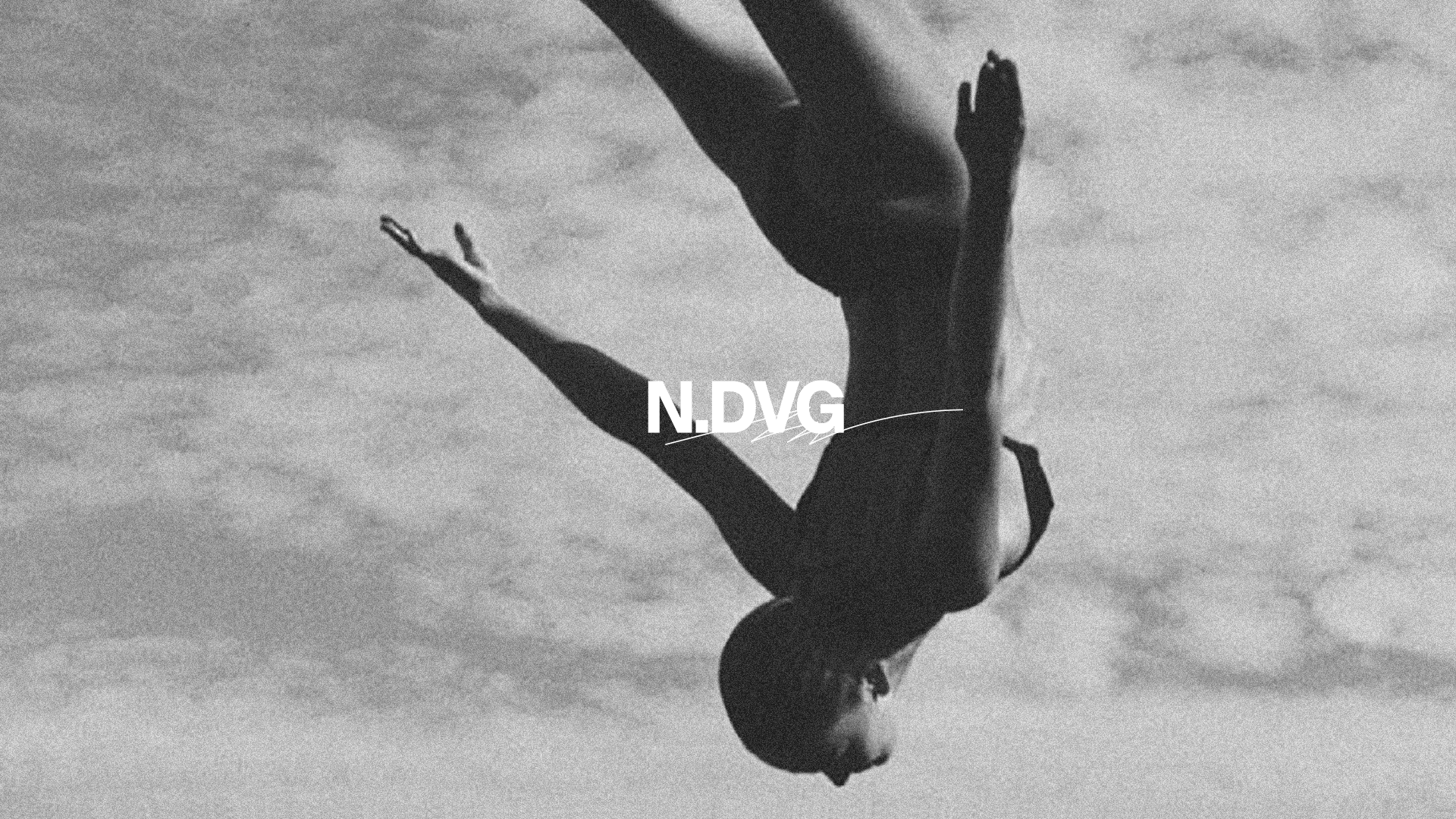
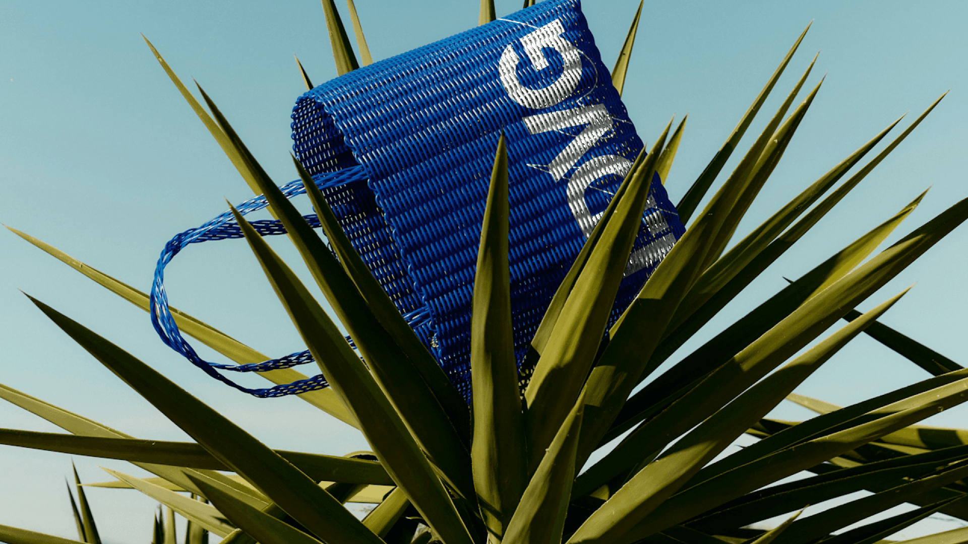
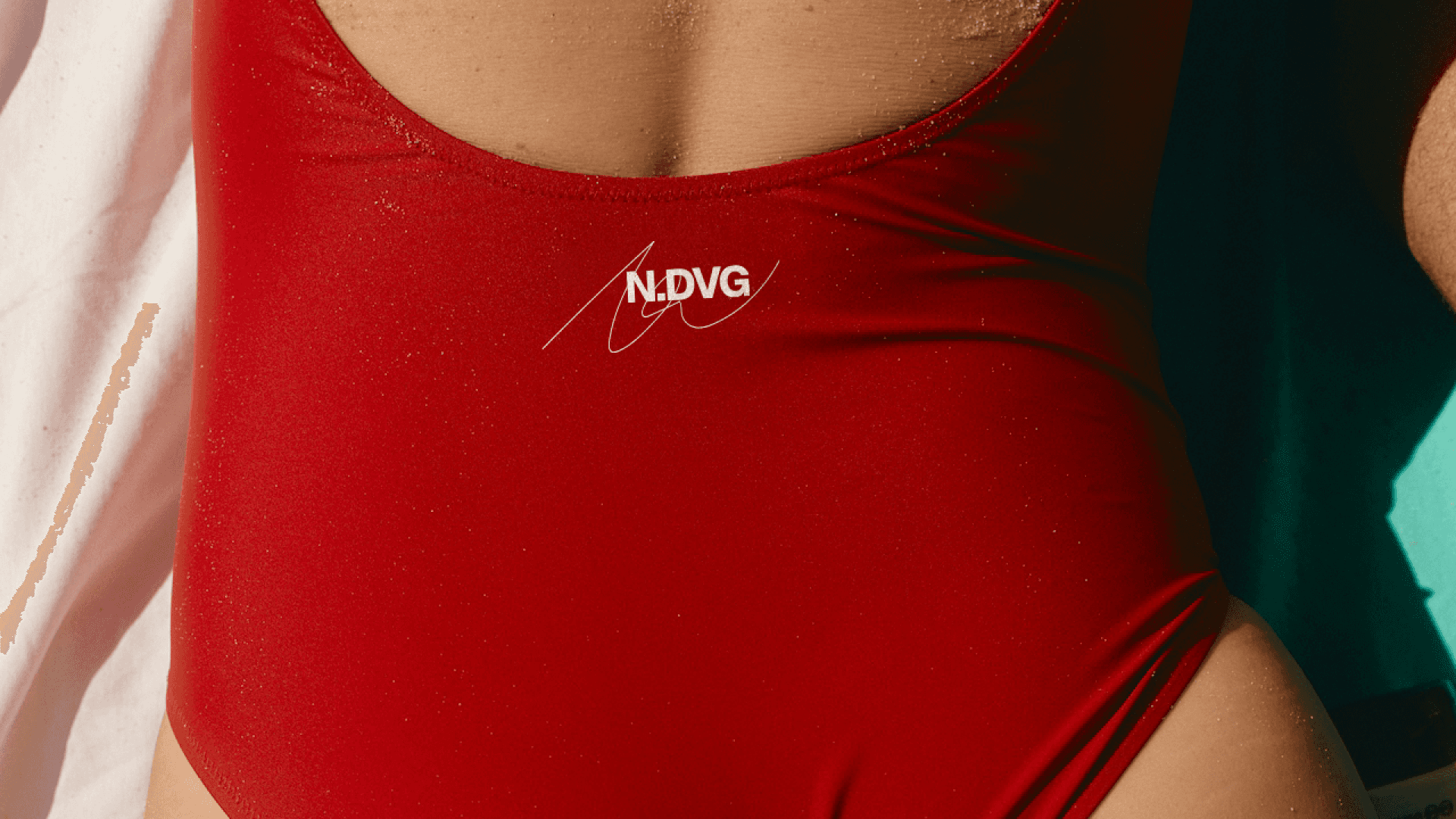
NO DIVING is a newly founded creative studio brand, built as a cultural platform operating across design, art, and collaboration.
NO DIVING began as a name before it became a brand. Borrowed from the language of restriction, it was intentionally contradictory—direct, confrontational, and open to interpretation. The name set the tone: this was not about permission or instruction, but about confidence and self-definition. From the outset, the goal was to build a platform rather than a polished brand—one that could live comfortably across art, music, fashion, and community without feeling fixed or overly resolved.
INTERPRETING WITHOUT PROXIMITY
NO DIVING was the first project we worked on together. At the outset, there was no shared history, no shorthand, and no personal familiarity to lean on. What made this particularly challenging—and meaningful—was that this project was also the most personal to Yasmin.
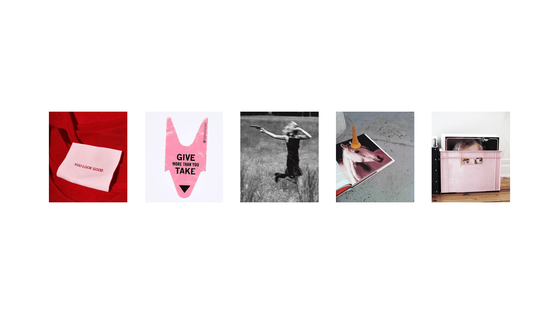
Rather than drawing from conversations or past collaboration, the starting point was observation. A Pinterest board became the primary reference. Not as a visual brief to replicate, but as a signal of energy, attitude, and intent. Tone mattered more than style. What felt instinctive, confident, irreverent, or restrained became more important than any single reference.
From there, the work became an exercise in reading between the lines: interpreting taste, rhythm, and point of view, and translating that into a brand with conviction. The goal wasn’t to mirror the references, but to capture the underlying attitude they pointed toward.
This distance required trust in process and judgement. Without proximity, clarity had to come from restraint, intuition, and alignment rather than instruction. The resulting brand is personal not because it reflects biography, but because it feels true to the energy it was built from.
WRITING THE BRAND BEFORE DESIGNING IT
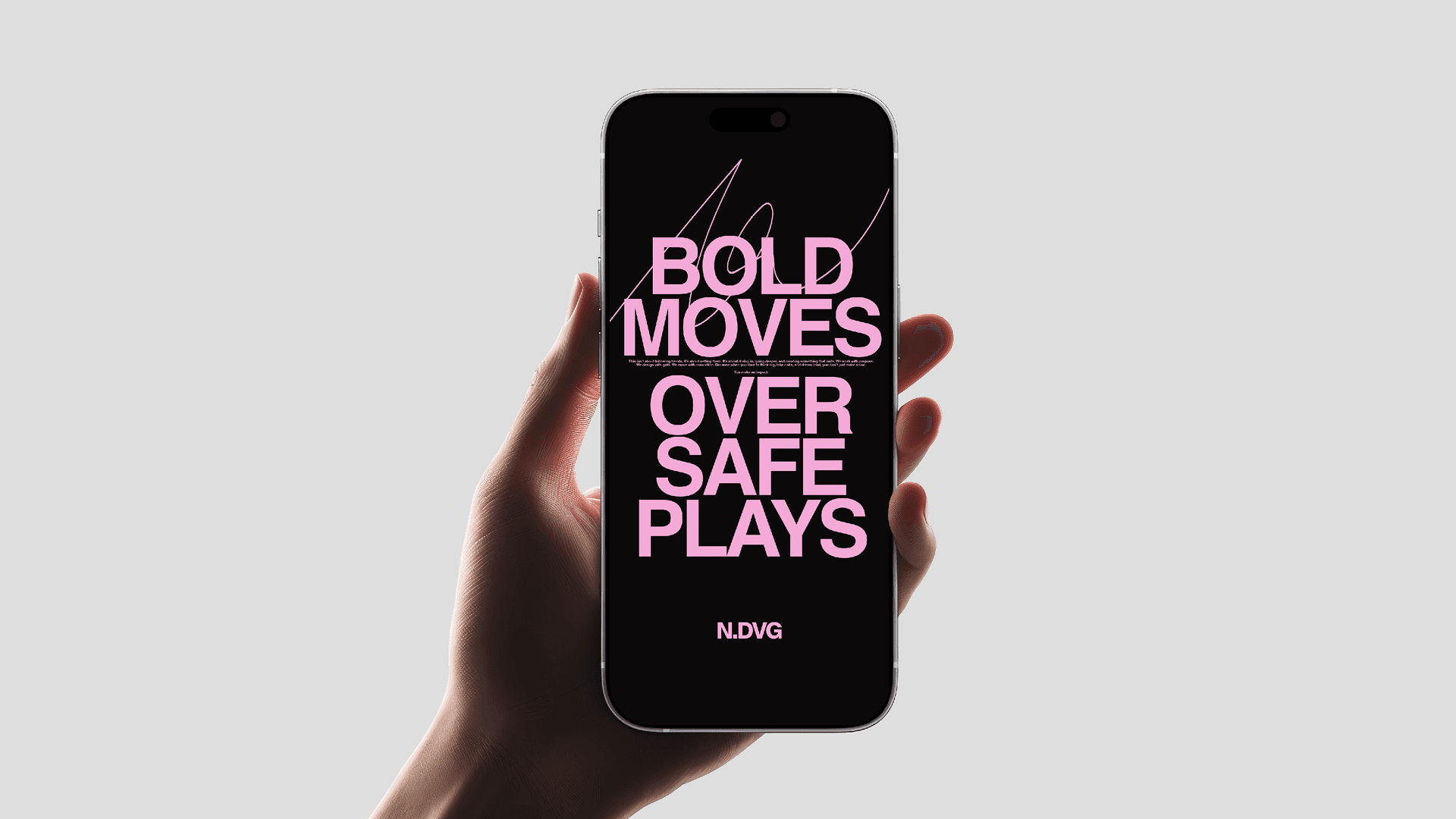
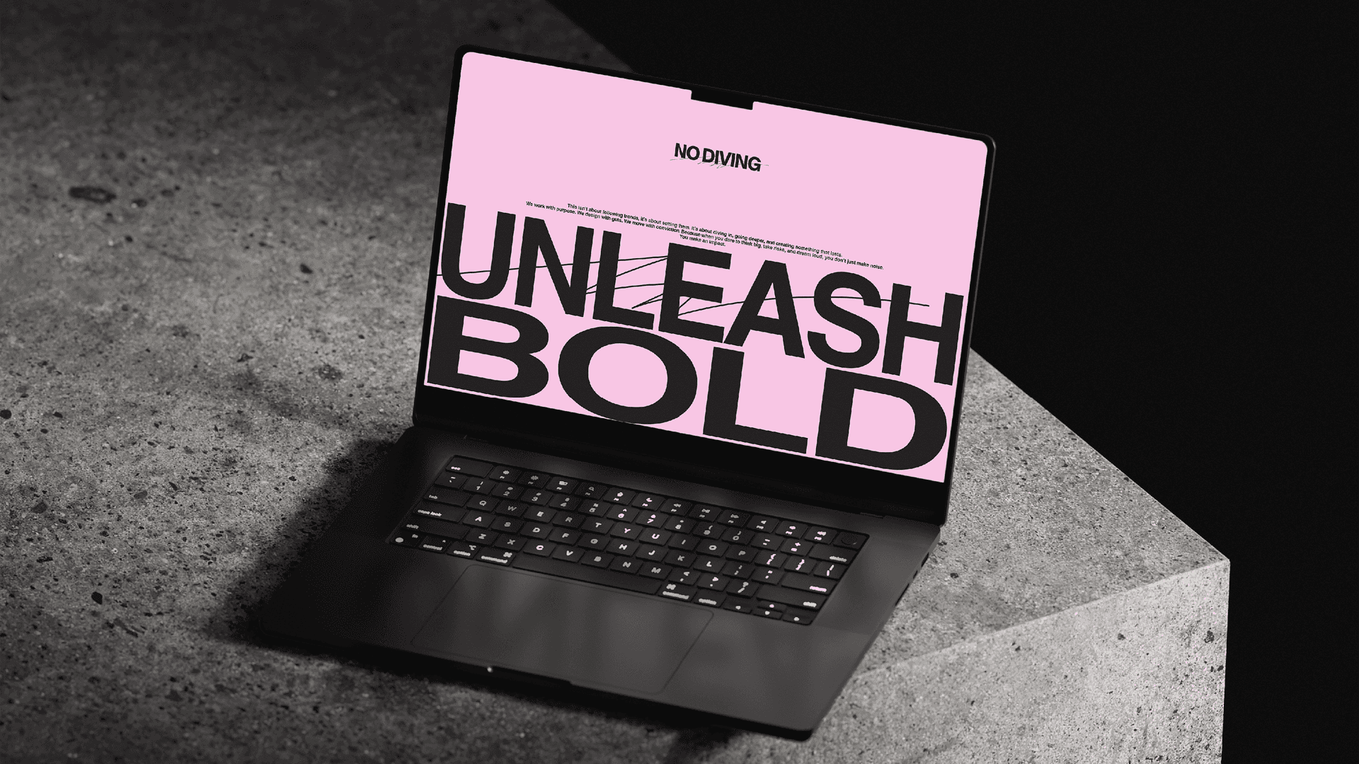
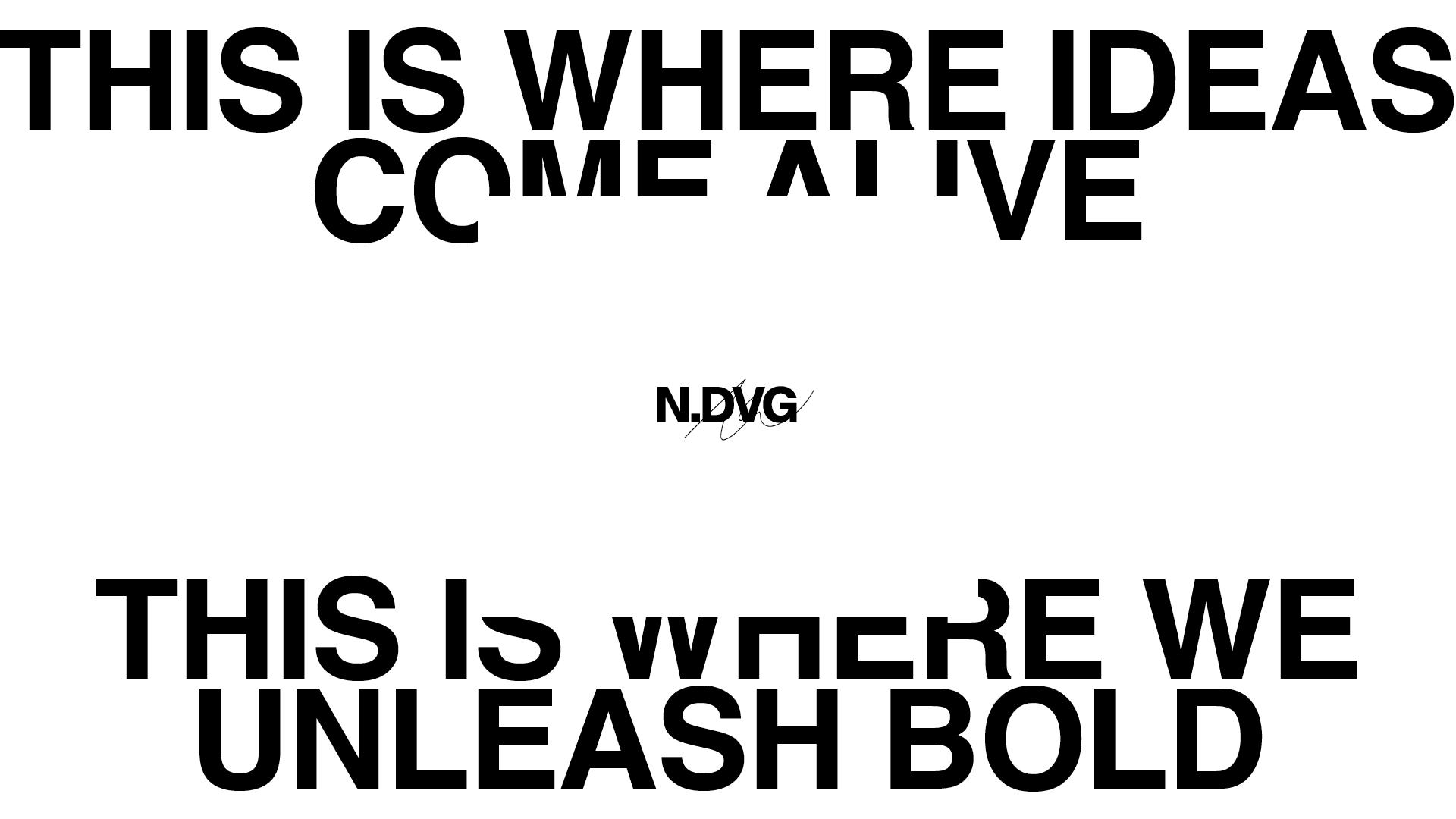
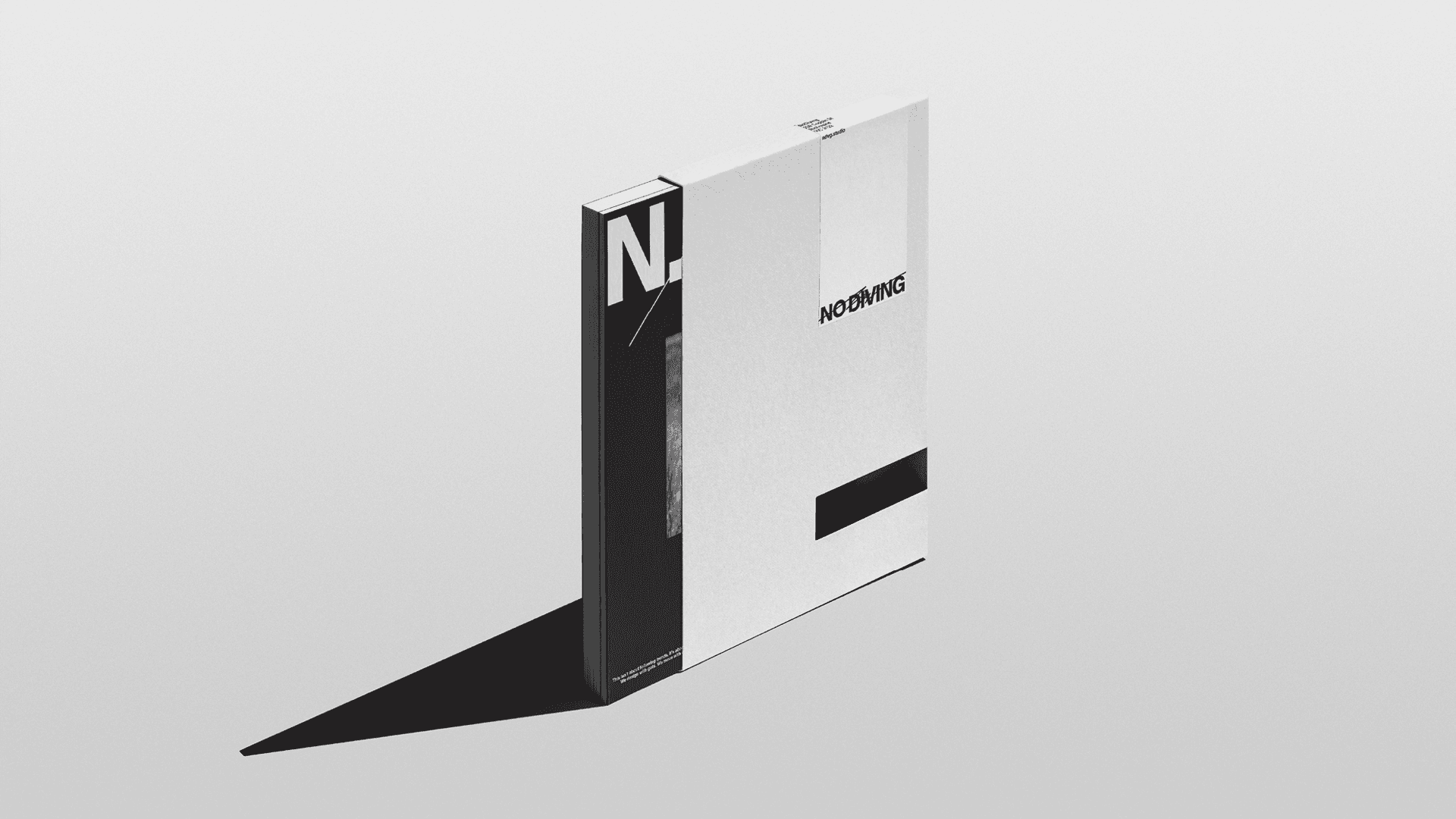
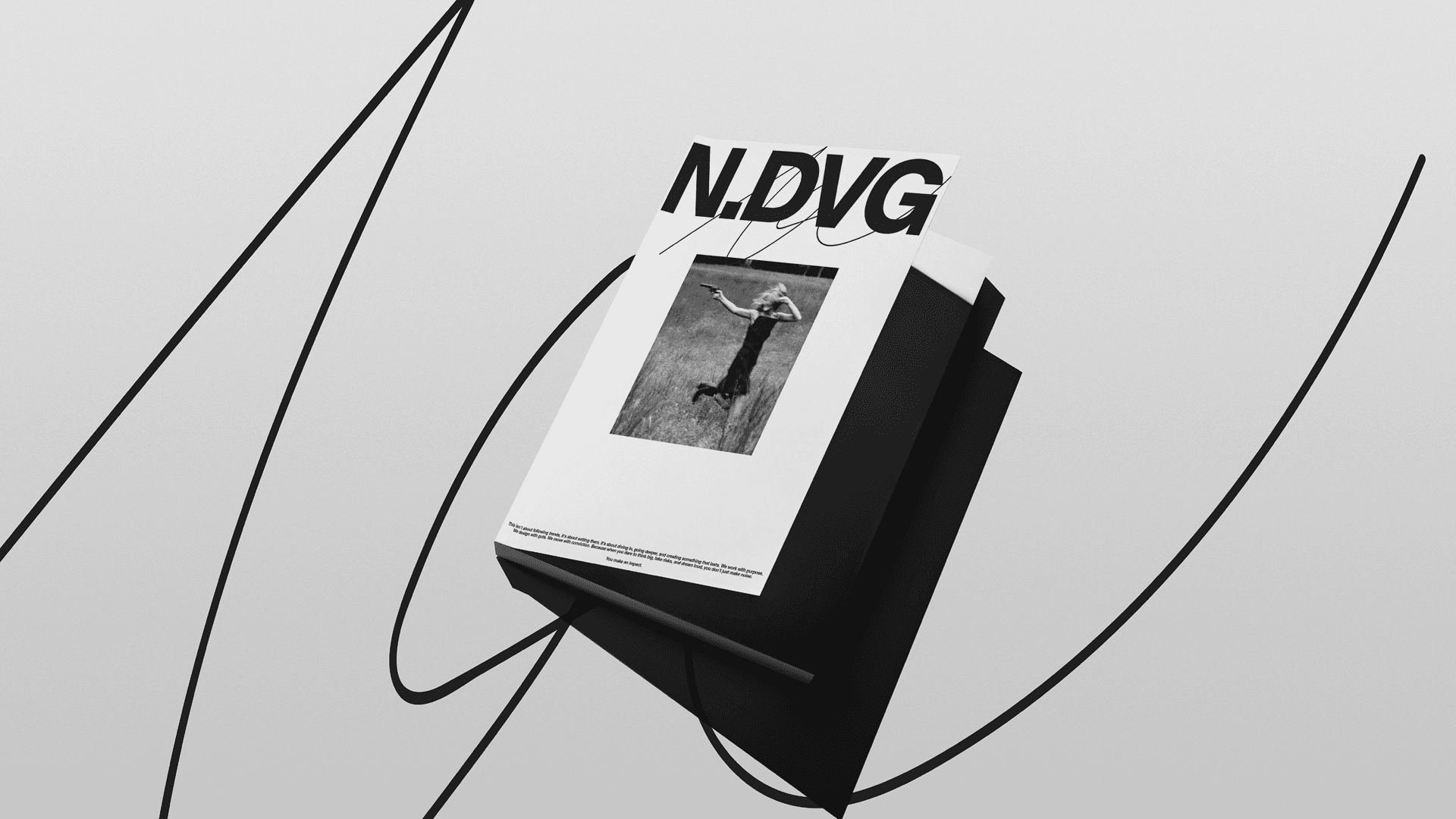
The NO DIVING brand book was conceived as more than a set of guidelines. It was written as a declaration of intent—capturing tone, ambition, and attitude before resolving form. Language played a central role in shaping the brand’s worldview, establishing confidence, energy, and cultural proximity as foundational traits rather than stylistic choices.
The book set out to define how the brand feels before determining how it looks—prioritising emotion, momentum, and conviction over polish.
Rather than imposing a rigid identity system, the process focused on defining a loose but deliberate framework. Typography, composition, and tone were treated as anchors—enough structure to hold consistency, but not so much that expression was constrained. The challenge was resisting the instinct to over-design. Where the work began to feel too controlled, it was loosened. Where it drifted toward chaos, it was pulled back. Balance was found through judgement, not rules.