OVERVIEW
The Bones is a fitness and movement studio undergoing a refined brand expression refresh alongside a new physical space.
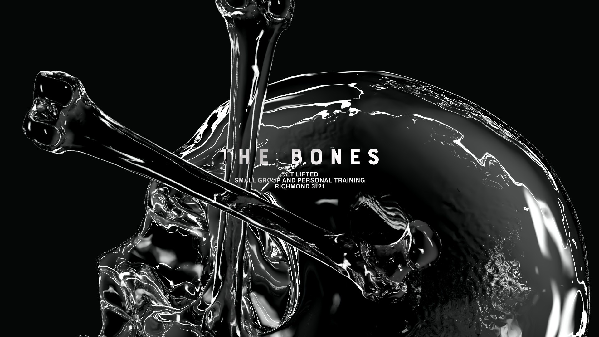
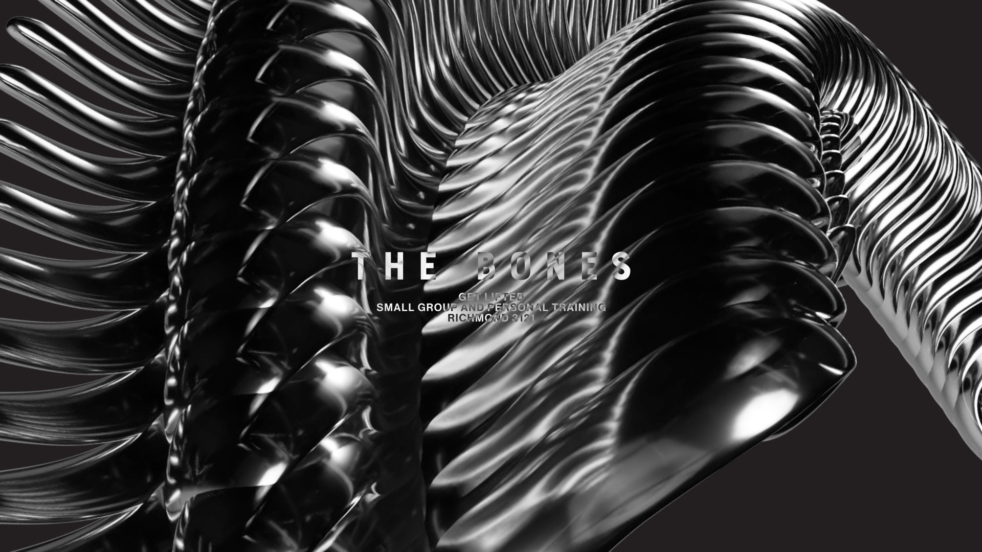
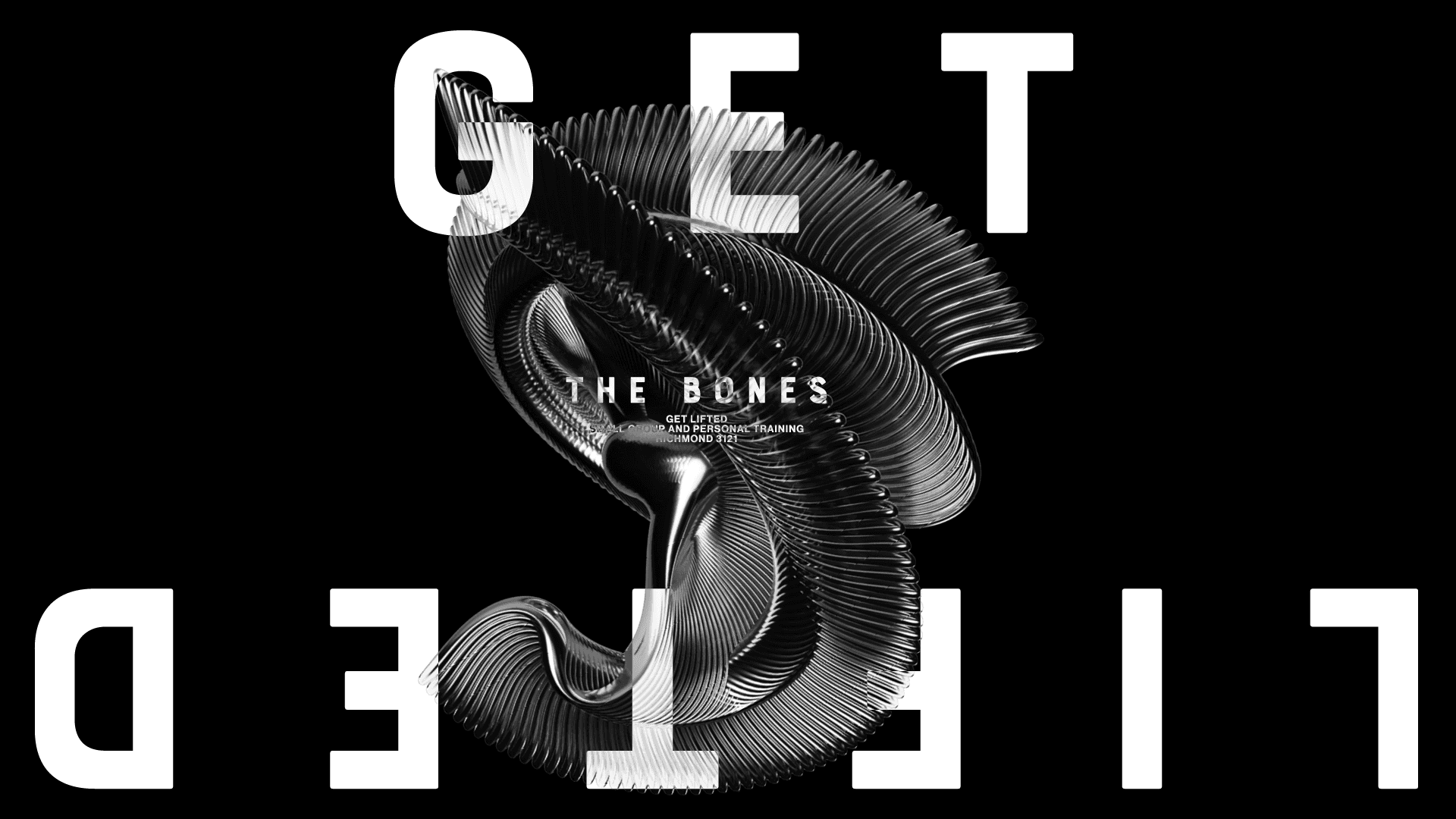
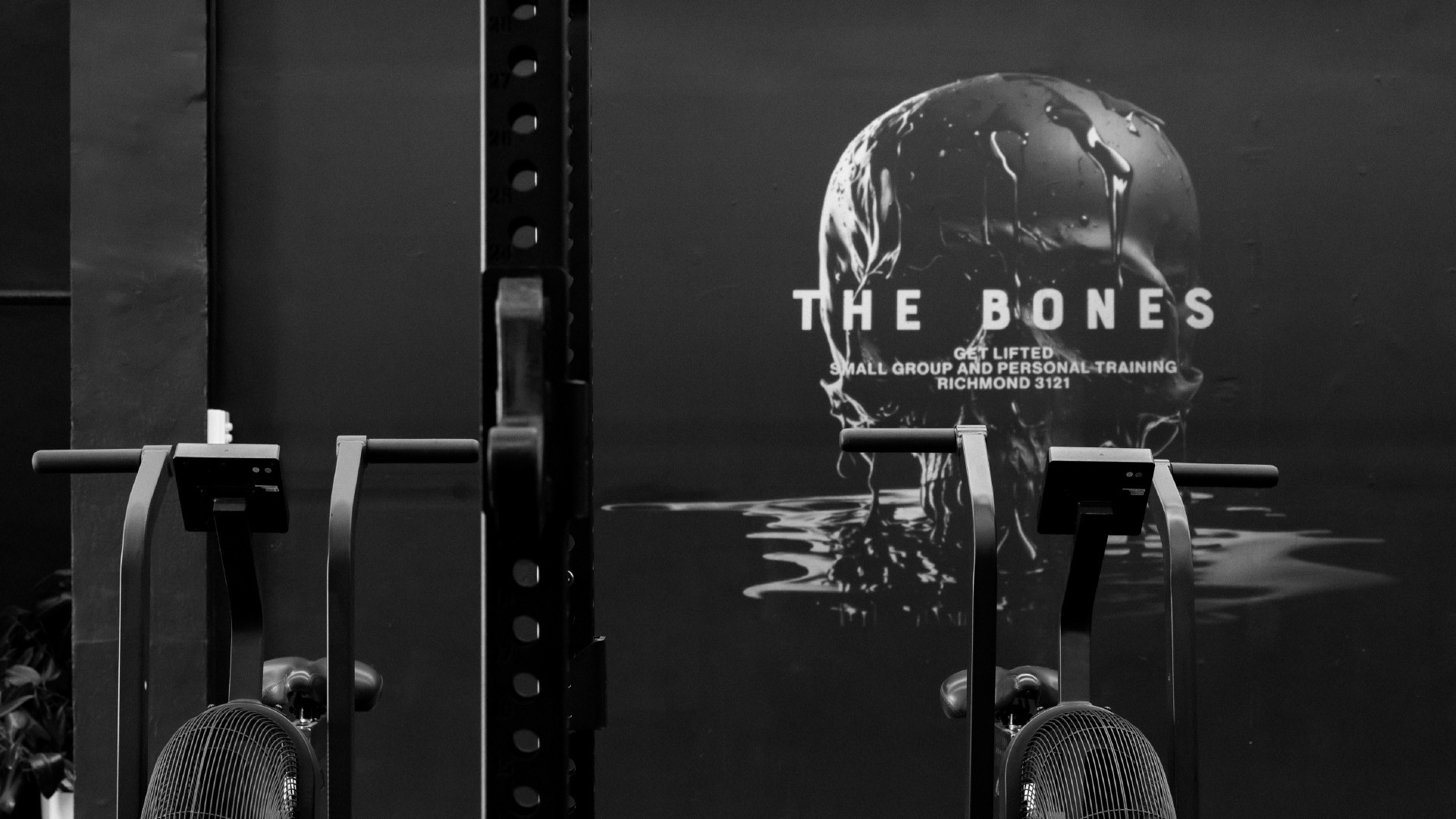
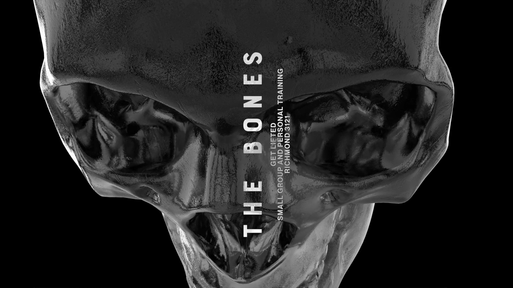
The Bones refresh began with a simple, honest brief: not a rebrand, but a joo-ge. A five-year glow up timed with the move into a new studio: clean, cool, sleek, and predominantly black. The objective was refinement, not reinvention. From the outset, the focus was on sharpening the brand’s expression to better align with the new physical environment, while preserving the equity already built within the community.
RESTRAINT AS STRATEGY
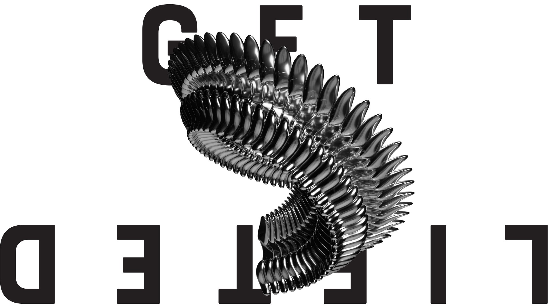
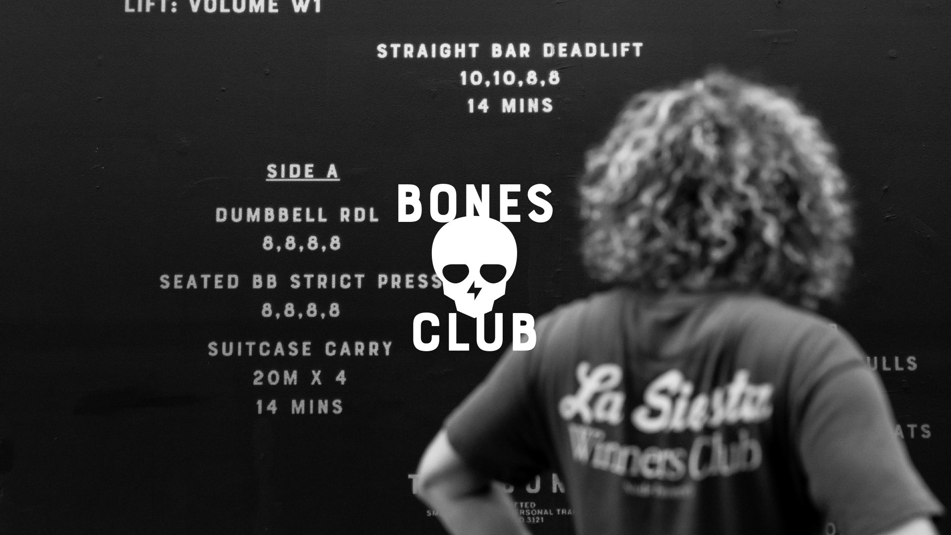
A key part of the process was deciding what not to change. The existing logo was left intact—not out of convenience, but because it already worked. Rather than redesigning it for the sake of novelty, the emphasis shifted to how the logo lived within the system, and what sat around it. Similarly, the primary typeface was retained. Its versatility and character remained relevant, but it was paired with a secondary typeface to introduce greater legibility, hierarchy, and depth. Adding layers without disrupting familiarity.
PERSONAL TASTE
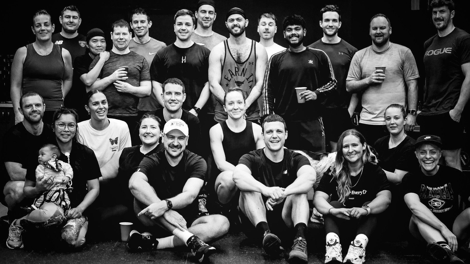
At the centre of the refresh was the founder’s personal aesthetic. The project became an exploration of how an individual point of view—taste, discipline, and visual preference—could meaningfully inform a brand system without becoming self-indulgent. Our role was to interpret that aesthetic and translate it into a cohesive visual language. One that felt considered, contemporary, and aligned with the studio’s values, rather than styled for effect.
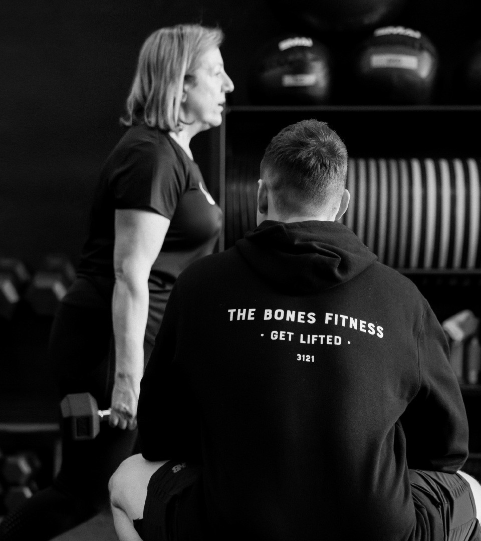
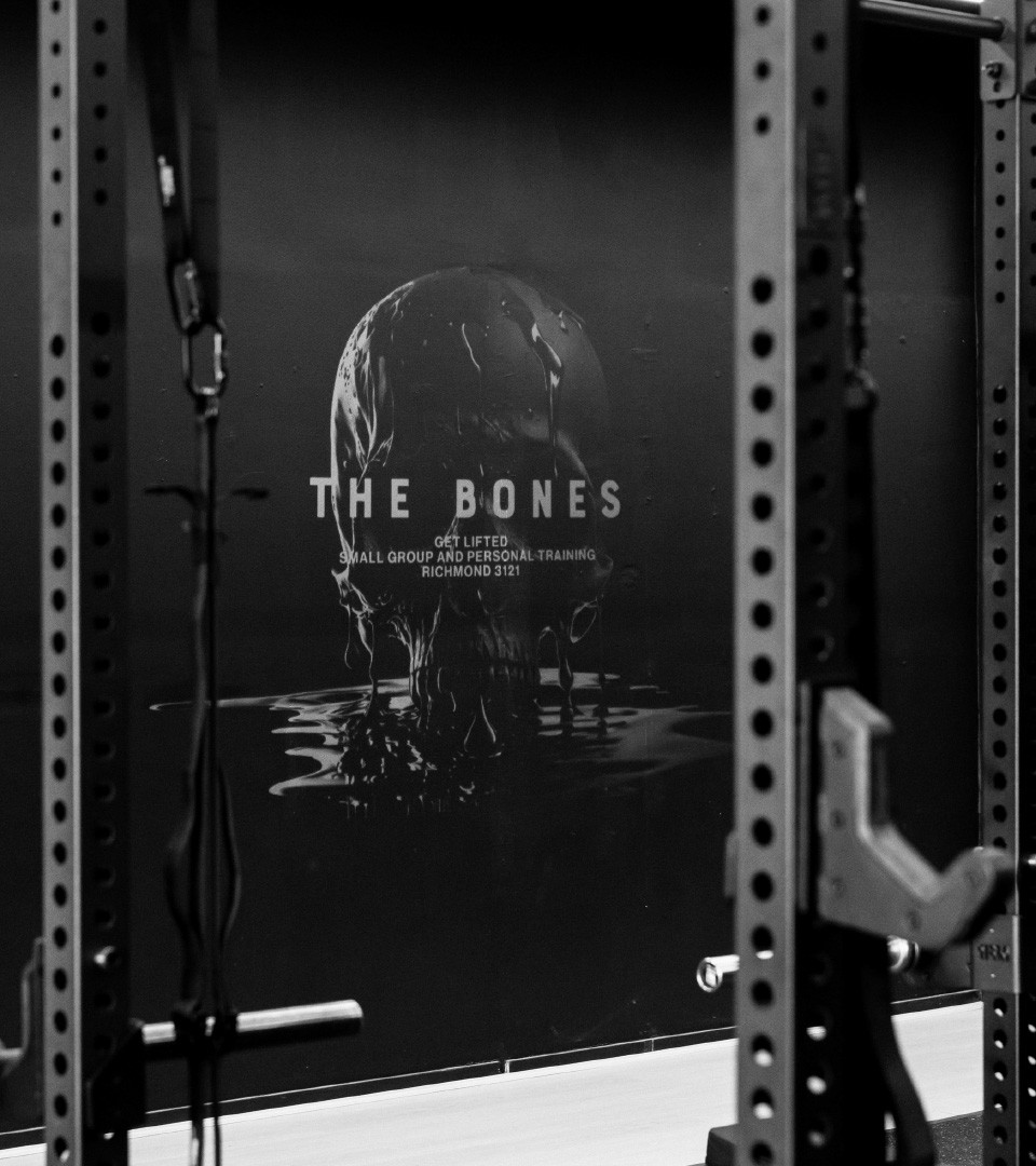
SPACE AS CATALYST
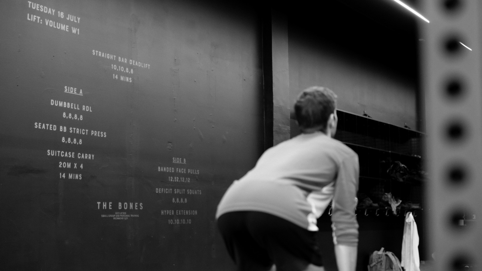
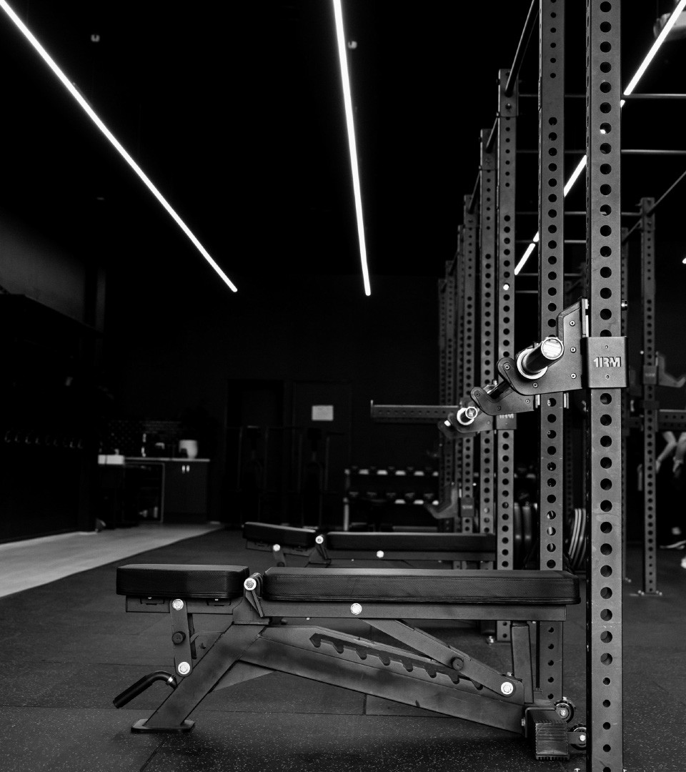
The new studio space acted as a catalyst rather than a constraint. Its architectural qualities informed the refreshed visual language—encouraging simplicity, structure, and clarity. The brand evolved in dialogue with the environment it now occupied, reinforcing a sense of cohesion between physical and visual identity.
The Bones demonstrated the value of knowing when to hold and when to refine. By respecting what already worked—and applying change only where it added clarity—the refresh strengthened the brand’s presence without eroding its identity. The measure of success wasn’t novelty, but alignment. As the founders described the outcome: “I FKN love it.”