OVERVIEW
Tired Leek is a hospitality concept imagined by Yao Ti and Imogen Lee. The name emerged almost accidentally, drawing from the phonetic overlap of their surnames. What began as a quiet coincidence became the foundation for a brand that embraces understatement, wit, and cultural texture.
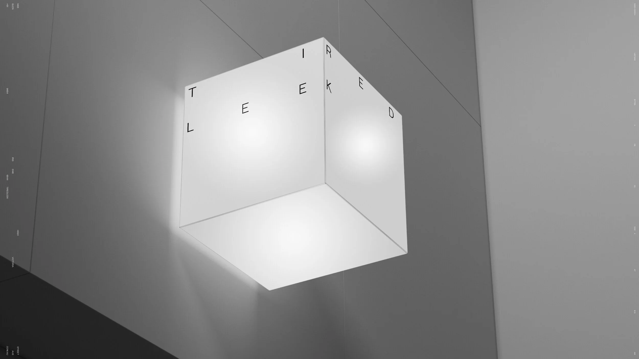
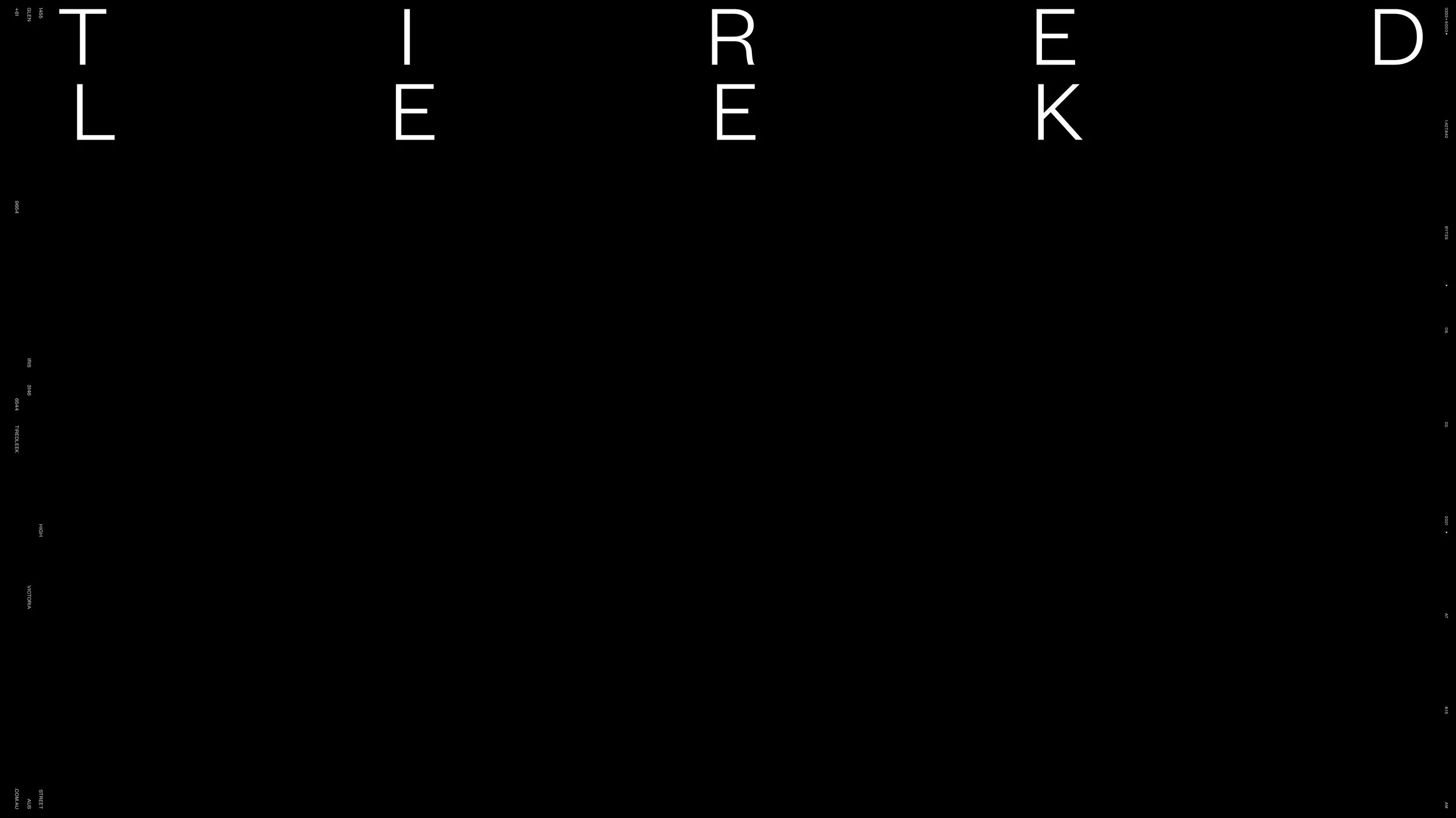
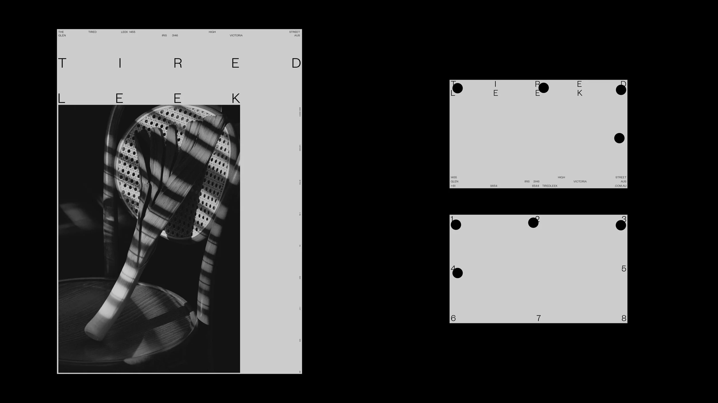
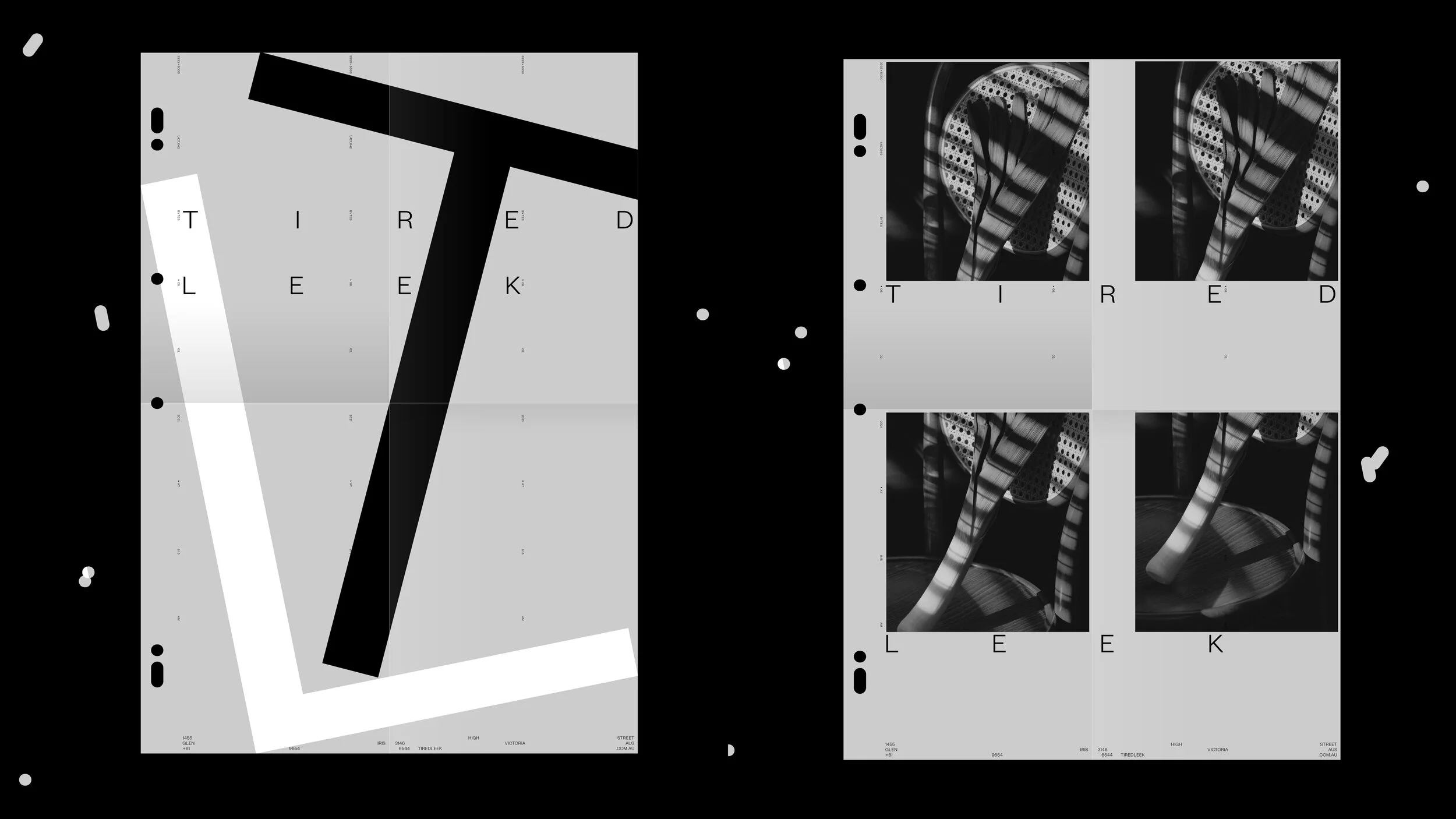
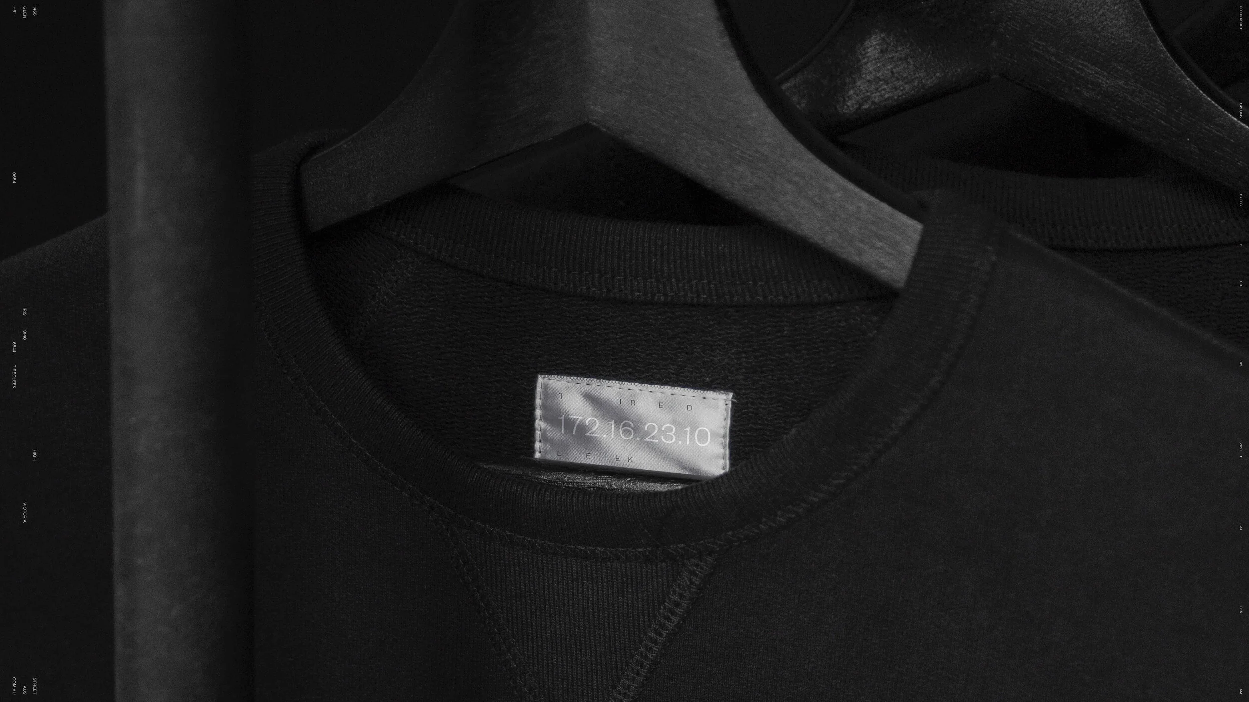
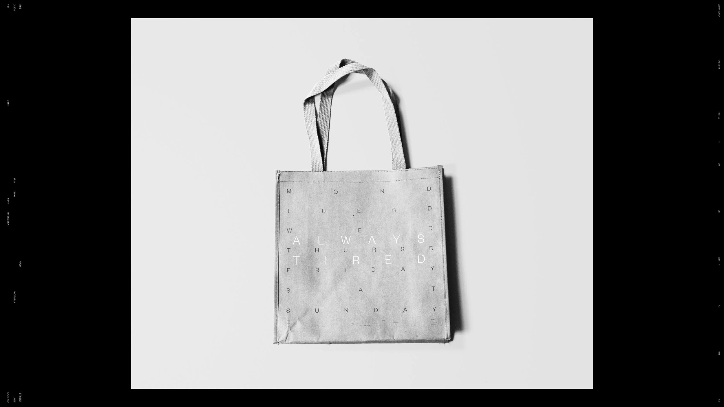
Our role was to shape the visual identity and graphic system around this tension. The brand language avoids overt hospitality tropes, instead leaning into typographic composition, spatial rhythm, and editorial restraint. Letterforms are treated as objects, stretched and repositioned across layouts to create pause and curiosity rather than immediate explanation.
The identity operates as a flexible system rather than a fixed mark. Typography, grids, and image framing work together to create a sense of calm and intention, allowing the brand to feel contemporary without becoming styled or precious. Black, grey, and white establish a neutral stage, while photography introduces tactility, atmosphere, and human presence.
This project reflects an approach where naming, typography, and spatial composition work in quiet alignment, allowing the brand to feel confident, cultural, and composed without overstatement.